
The 25 most physically active places in the US, according to data
How physical activity varies across the country ©Northwell Health
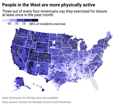
Income is a potent predictor of the time a person devotes to physical exercise. People on lower incomes can face greater challenges when trying to exercise consistently because adequate public spaces may not be available, gym membership and workout equipment are expensive, and they may have less flexible work schedules.
A 2018 research paper found that among adolescents and young adults, people in families with higher incomes, as well as men and white people, were more likely than others to engage in physical activity.
The Peter G. Peterson Foundation reported that, in 2021, households in Northeastern and Western states earned, on average, $7,000 to $15,000 more a year than households in the Midwest and South, respectively. People who live in those regions are more likely to report higher rates of physical activity.
The Geography of Health and Longevity in Montana (and the Rest of the U.S.)
Article-Grid, County Atlas of Montana, Health, Montana Atlas, Northern California / Martin W. Lewis
Life expectancy in the United States – Vivid MapsLife expectancy by county ranges from 67 to 85 in the USA | NextBigFuture.com
In the United States as a whole, several county-clusters of relatively low life expectancy stand out. The most prominent is in eastern Kentucky, southern West Virginia, and southern Ohio, an area mostly inhabited by Euro-Americans.
Several areas demographically dominated by African Americans also post low longevity figures, including the southern Mississippi Valley and a few of the large cities that are visible on this county-level map, such as Baltimore and Saint Louis.
Almost all counties with large Native American populations also have relatively low figures. Counties with Hispanic majorities, in contrast, generally have average or high levels of longevity, as is clearly visible in southern Texas.
Although life expectancy tends to correlate with income, the correlation collapses in many of these areas. Hidalgo County, Texas is over 91 percent Hispanic and has a per capita income of only $12,130, making it “one of the poorest counties in the United States,” but it ranks in the highest longevity category on this map. In Camp County, in northeast Texas, the average life expectancy of white residents is only 74 years, whereas that of Hispanics is 92 years. In most Texas countries, Hispanics outlive whites. Presumably, diet and activity levels are major factors.
Life expectancy varies significantly across Montana, with some counties falling in the highest category and others in the lowest. In Montana, low figures are found in counties with large Native American populations and in the former mining and smelting counties of Silver Bow and Deer Lodge. The relatively wealthier counties of south-central Montana post high longevity figures.
Heart Disease and Drinking Alcohol – Search Images
heart disease rates united states map – Search
Heart Disease Facts | Heart Disease | CDC
The map of heart-disease deaths in the United States shows some stark geographically patterns.
Rates are highest in the south-central part of the country but are also elevated across most of the eastern Midwest. Heart disease death rates tend to be lower in major metropolitan counties as well as in rural countries across much of the West and western Midwest.
Many of the patterns seen on this map are difficult to interpret. Why, for example, would heart-disease death rates be much lower in western North Carolina than in eastern Tennessee? (Perhaps the obesity map, posted below, offers a partial explanation, although only by begging the question.)
And why would some counties that are demographically dominated by Native Americans have very high rates whereas others, especially those in New Mexico and Arizona, have very low rates? In Montana heart disease tends to be elevated in Native American counties – and in Silver Bow (Butte). South-central Montana has low rates.
Map Shows States With Higher Cancer Rates – Newsweek
On the U.S. cancer death-rate map of 2020, high rates are clearly evident in areas demographically dominated by poor white people (central Appalachia) and poor Black people (the inland delta of the Mississippi in western Mississippi and eastern Arkansas).
Low rates tend to be found in the Rocky Mountains, south Florida, and parts of the northern Great Plains. No clear patterns are evident in Montana. Gallatin and Liberty counties fall in the lowest category found in the state yet have almost nothing in common. The small population of Liberty County, however, makes comparison difficult.
Finally, the patterns seen on the U.S. obesity map are similar to those seen on the preceding maps.
The low rates found in the Rocky Mountains, extending from northern New Mexico to northwest Montana, are notable. The northern Great Plains have a higher obesity rate than might be expected based on other health indicators.
Some odd juxtapositions are found on this map, with several neighboring counties of similar demographic characteristics posting very different figures. Why, for example, would Pecos County in West Texas have such higher rates than its neighbors? In Montana, it is not surprising that Gallatin County, with its youthful, outdoor focused population, has the lowest obesity rate.
Aurora Illinois cancer rates – Search Santa Fe cancer rates – Search
Providence cancer rates – Search Little Rock cancer rates – Search
Jackson Mississippi cancer rates – Search Mobile Alabama cancer rates – Search
Tallahassee cancer rate – Search Greenville SC cancer rate – Search
Charleston SC cancer rate – Search Charleston WV cancer rate – Search
Des Moines cancer rate – Search Dover Delaware cancer rate – Search
📊 As of 2022, about 26.8% of adult New Yorkers were classified as obese, based on self-reported height and weight.
But that citywide average hides some striking neighborhood differences:
🏙️ Obesity Rates by Borough
| Borough | Obesity Rate (%) |
|---|---|
| Bronx | 37.4 |
| Staten Island | 33.0 |
| Brooklyn | 26.3 |
| Queens | 25.2 |
| Manhattan | 20.2 |
📍 Notable Neighborhoods
- South Bronx: 39.4%
- East New York (Brooklyn): 44.2%
- East Harlem (Manhattan): 39.2%
- Upper East Side (Manhattan): Just 9.0%
People also ask
What does Filth mean?
Staten Island Has A landfill in their backyard offensive or disgusting dirt or refuse; foul matter. the filth dumped into our rivers. foul condition. to live in filth. moral impurity, corruption, or obscenity. vulgar or obscene language or thought.
The Staten Island Advance/SILive.com analyzed data from the New York State Cancer Registry to see how the borough’s cancer rates stack up against the rest of New York City and the state at large. To account for varying population levels between the boroughs, the Advance/SILive.com used a rate per 100,000 population as opposed to average number of annual cases.
The cancer rate per 100,000 population on Staten Island is 517.4 cases, which is approximately 18.6% higher than the next closest borough, Manhattan. This rate includes all invasive malignant tumors, covering all types of cancer. Staten Island has the highest rate of any borough for 15 of the 25 cancers tracked by the state, with female breast cancer having the highest rate at 139.1 per 100,000 population.
Other cancers with high rates include prostate cancer, lung and bronchus cancers, and thyroid cancer. The borough’s high cancer rates are particularly perplexing when considering that the other four boroughs boast some of the lowest rates of all 62 counties in the state.
The borough’s rate of 517.4 cases per 100,000 population for all cancers was roughly 18.6% higher than the next closest borough, Manhattan, which had a rate of 436.2 cases per 100,000 population. Queens, the Bronx and Brooklyn had per 100,000 population rates of 415.5, 422.9 and 430.7, respectively.
Staten Island’s high cancer rates are particularly perplexing when considering that the other four boroughs boast some of the lowest rates of all 62 counties in the state. Queens, the Bronx, Brooklyn and Manhattan have the first, third, fourth and fifth lowest cancer rates of any county in New York, while Staten Island has the 17th-highest.
Here’s what the state found in a study of Staten Island cancer rates
The New York State Department of Health (NYSDOH) conducted a study on Staten Island cancer rates, revealing that the borough had the highest rate of all cancers combined in New York City based on 2011-2015 data. The study found that the rate of all cancers combined on Staten Island was 16% higher than for New York City, as a whole, and 3% higher than New York State, excluding the rest of New York City.
However, when evaluating each type of cancer individually, thyroid cancer was the only cancer that stood out as unusually high compared to other areas of New York State. The study aimed to identify reasons for the cancer patterns present on Staten Island and to offer recommendations and policy proposals to enhance prevention and community screening efforts.
Here’s what the state found in a study of Staten Island cancer rates
— Two years after Gov. Andrew Cuomo’s office announced a study to evaluate high cancer rates on Staten Island, the NYS Department of Health (NYSDOH) is returning to the borough to… https://www.silive.com › news › heres-what-the-state-found-in-study-of-staten-island-cancer-rates.html
Source: Staten Island has highest rate in NYC of these 15 cancers, malignant tumors – silive.com

These disparities often reflect differences in access to healthy food, safe spaces for physical activity, and socioeconomic conditions. Want to explore how NYC is tackling these challenges or dive into youth obesity trends? I’ve got more data where that came from.
Baton Rouge, Louisiana, sits within an 85-mile stretch known as “Cancer Alley”, which has some of the highest cancer risks from toxic air pollution in the United States. Here’s a snapshot of the cancer statistics for the area:
📊 East Baton Rouge Parish Cancer Rate
- Age-adjusted incidence rate: 475.3 cases per 100,000 people (2017–2021 average)
- Trend: Stable over the past five years
- Average annual cancer cases: ~2,354
This rate is slightly below the Louisiana state average of 483.6 per 100,000, but still above the national average of 444.4.
🏭 Environmental Factors
- Baton Rouge is part of Cancer Alley, home to over 200 petrochemical facilities
- Air pollution-related cancer risk in the region is estimated to be up to 7 times higher than the national average
- Studies show poverty and race play a role in cancer risk, with Black and low-income communities disproportionately affected4
If you’re curious about how these rates compare to other parishes or want to explore specific types of cancer, I can dig deeper. Want to look into environmental justice efforts or health resources in the area? 1www.the-express.com 2statecancerprofiles.cancer.gov 3www.wwno.org 4
Tulane study: Louisiana’s severe air pollution linked to dozens of cancer cases each year | tulane
US Ancestry Map | United States Ancestry Map [USA]
Coke vs. Pepsi? According to one study, here’s each state’s favorite soft drink
US Ancestry Map | United States Ancestry Map [USA]
Demographics of the United States – Wikipedia