
In Florida the further north you go the more south it gets.
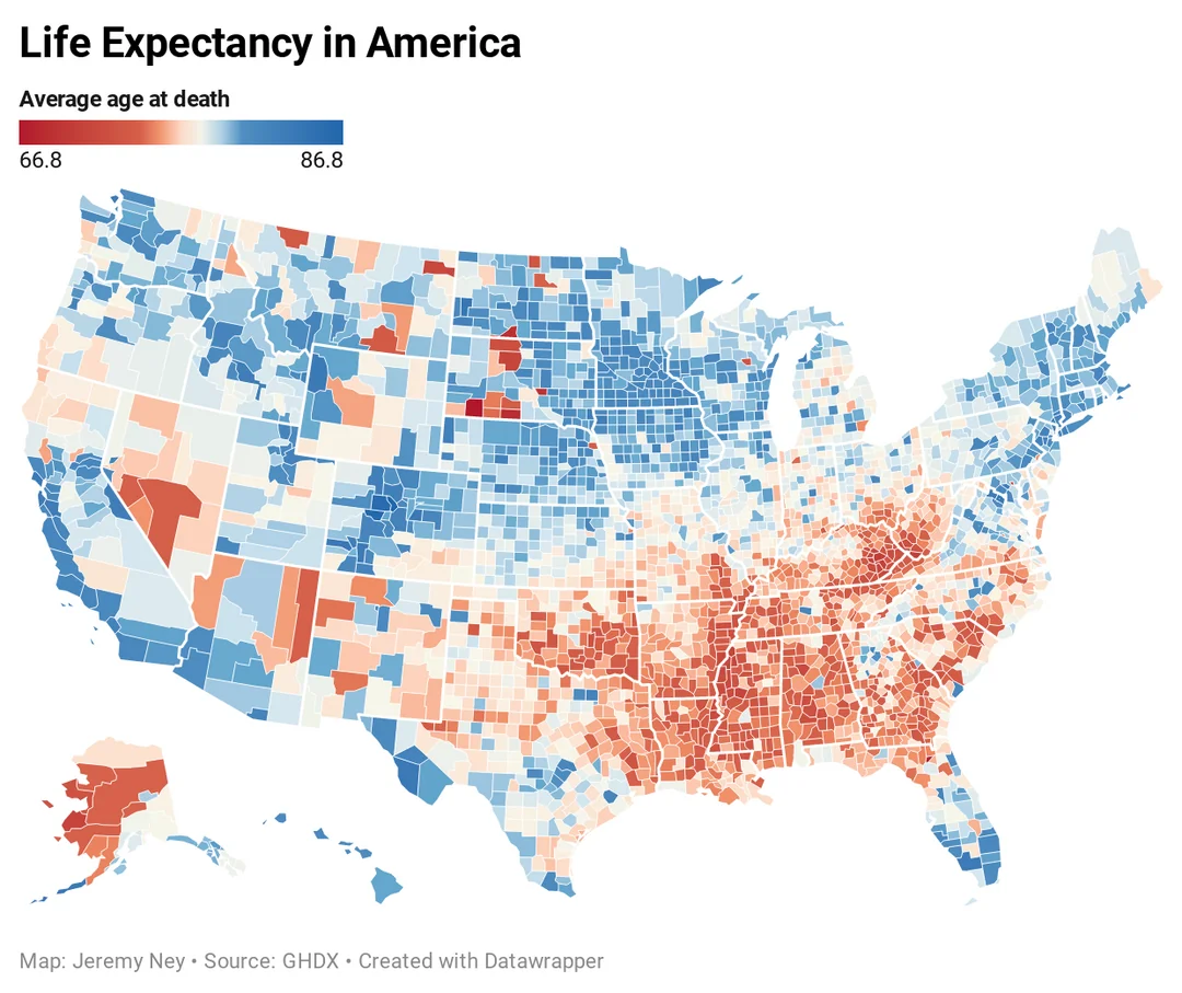
US life expectancy – America is now facing the greatest divide in life expectancy across regions in the last 40 years. Holy shit, the scale has a range of 20 years.. Also, North Florida is much more rural, with more limited access to health systems. That one blue colored county in the Panhandle is Leon County and the only reason it’s blue is because
it contains the capital of Tallahassee and its multitude of clinics and hospitals. I wonder how this correlates with access to affordable Healthcare. The map correlates almost perfectly with a per capita income map.
There’s an even better correlation with obesity rates.
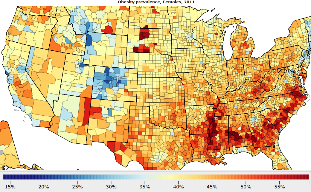
Look at these Images. County Obesity Rates and life expectancy – Search Images
It tracks down the county in many areas.
It is. There’s a correlation between wealth/poverty and life expectancy.
Column: America’s decline in life expectancy speaks volumes about our problems (msn.com)
Of course, obesity is also correlated with income level and access to healthcare.
Also North Florida is much more rural, with more limited access to health systems. That one blue colored county in the Panhandle is Leon County and the only reason it’s blue is because it contains the capital of Tallahassee and its multitude of clinics and hospitals.
Why is it that Mississippi, which has a life expectancy of 74.4,
is portrayed as having a much lower life expectancy on this map?
Infant mortality for black babies is astonishingly high in the south.
The Mississippi River is known as cancer alley. All herbicides and pesticides near it end up draining into that river. These chemicals destroy the gut lining and prohibit the transfer of nutrients from plants to humans both leading to higher cancer rates. Look up Dr. Zach Bush for more information. – Search Videos (bing.com)
Then you get all the fun oil and gas chemicals from LA and TX. Ook, you smoking bro?
Another explanation, there are a lot of obese and poor African Americans that live there..
I respect your objection about poverty. I just ask you to listen to the rich roll podcast with Dr. Zach Bush. I think this could be correlation rather than causation.
As well Wisconsin is totally blue.
While Louisiana very red as well?
The lighter shades of red are where most of the people live.
The very red rural counties along the river have relatively few people. I wish there was an elegant way of simultaneously portraying population density on a map like this, but I can’t think of a good way to do that. A cartogram would achieve this, although it also makes the image more confusing since we’re expecting it to look like a typical map and get distracted when it doesn’t conform to that expectation… Maybe a dot density plot? Basically, within each county, have a number of (very) small dots in rough proportion to population of the county.
Also, the most striking to me is the disparity between red Detroit (Wayne County, MI)
and blue Ann Arbor (Washtenaw County, MI) just west of it.
What is Southern Minnesota doing?
Anytime somebody starts to look dead, they just rush ’em to the nearby Mayo Clinic, and presto! Alive again! The Mayo Clinic is one of the best hospital systems in the world and runs basically all healthcare in Southern Minnesota and Western Wisconsin.
That region is generally one of the healthiest states in the country. I live 70 miles or
112.65 km from that red square in Wisconsin. We should really reevaluate how we are compensating native Americans. They need services and healthcare, not just land. ~Anonymous
Southern Minnesota is the least Scandinavian part of the state.
Don’t get me wrong, it’s more Scandinavian than the average place in the US but not for Minnesota standards. I swear to god those people are immune to everything. My guess is that we just have a culture of healthier eating and exercise. At my work not a single person is obese . We value outdoor activities and staying healthy. Also having mayo probably helps, but my perception is that you only go there for oddball things or specialty treatments. I haven’t had any close family ever go there.
The twin cities seem to have good hospitals.
The difference in life expectancy between the healthiest and least healthy counties on this map is greater than the difference between US and Mali. https://ourworldindata.org/life-expectancy
Also, I wish this map used a more varied gradient because the bottom and top percentiles all look the same colour to me. Many of the red spots in the west correlate with native american reservations. Yeah reservations are extremely poor. The county with the lowest life expectancy in the US, Oglala Lakota County, is a reservation.
Many of the areas in the west correlate with Native American reservations. I go to the pine ridge reservation in South Dakota every year and talk to a lot of the natives there. Part of the reason their life expectancy is so low is because of the high rates of suicide, improper diets, and drugs. Its really heartbreaking actually.
Looking at: https://en.wikipedia.org/wiki/List_of_countries_by_life_expectancy
The countries most close to the bottom end of the US spectrum are:
Eritrea – 66.3
Gabon – 66.5
Ethiopia – 66..6
Kenya – 66.8
Madagascar – 67.0
Djibouti – 67.2
Myanmar – 67.2
Pakistan – 67.4
Where you live in America can have a major effect on how young you die.
Story by By Colin Woodard
So, if you say coke, that takes 20 years off your life. Pop is a solid 10.
Soda for the win Direct Correlation
On paper, Lexington County, S.C., and Placer County, Calif., have a lot in common.
They’re both big, wealthy, suburban counties with white supermajorities that border on their respective state’s capital cities. They both were at the vanguard of their states’ 20th century Republican advances — Lexington in the 1960s when it pivoted from the racist Dixiecrats; Placer with the Reagan Revolution in 1980 — and twice voted for Donald Trump by wide margins. But when it comes to how long their residents can count on living, the parallels fall apart. Placer has a Scandinavia-like life expectancy of 82.3 years. In Lexington, the figure is 77.7, a little worse than China’s.
Or take Maine’s far-flung Washington County,
the poorest in New England where the per capita income is $27,437.
The county is a hardscrabble swath of blueberry fields, forestland and fishing ports that was ravaged by the opioid epidemic and is almost completely white. It has one of the worst life expectancies in the entire Northeast: 75.5 years. But that’s more than six years better than the equally remote, forested, impoverished, white and drug-battered Perry County of eastern Kentucky.
The truth of life expectancy in America is that places with comparable profiles —
similar advantages and similar problems — have widely different average life outcomes depending on what part of the country they belong to.
Step back and look at a map of life expectancy across the country and the geographic patterns are as dramatic as they are obvious. If you live pretty much anywhere in the contiguous U.S., you can expect to live more than 78 years, unless you’re in the Deep South or the sprawling region I call Greater Appalachia, a region that stretches from southwestern Pennsylvania to the Ozarks and the Hill Country of Texas.
Those two regions — which include all or parts of 16 deep red states and a majority of the House Republican caucus — have a life expectancy of 77, more than four and a half years lower than on the blue-leaning Pacific coastal plain.
In the smaller, redder regional culture of New France (in southern Louisiana) the gap is just short of six years. So large are the regional gaps that the poorest set of counties in predominantly blue Yankee Northeast actually have higher life expectancies than the wealthiest ones in the Deep South. At a population level, a difference of five years is like the gap separating the U.S. from decidedly non wealthy Mongolia, Belarus or Libya, and six years gets you to impoverished El Salvador and Egypt.
It’s as if we are living in different countries.
Because in a very real historical and political sense, we are.
The geography of U.S. life expectancy — and the policy environments that determine it — is the result of differences that are regional, cultural and political, with roots going back centuries to the people who arrived on the continent with totally different ideas about equality, the proper role of government, and the correct balance point between individual liberty and the common good.
Once you understand how the country was colonized — and by whom — a number of insights into Americans’ overall health and longevity are revealed, along with some paths to improve the situation.
As was discussed in a widely read article on gun violence earlier this year, when it comes to defining U.S. regions you need to forget the Census Bureau’s divisions, which arbitrarily divide the country into a Northeast, Midwest, South and West, using often meaningless state boundaries and a depressing ignorance of history.
The reason the U.S. has strong regional differences is precisely because our swath of the North American continent was settled in the 17th and 18th centuries by rival colonial projects that had very little in common, often despised one another and spread without regard for today’s state (or even international) boundaries.
Those colonial projects — Puritan-controlled New England; the Dutch-settled area
around what is now New York City; the Quaker-founded Delaware Valley; the Scots Irish-dominated upland backcountry of the Appalachians; the West Indies-style slave society in the Deep South; the Spanish project in the southwest and so on — had different religious, economic and ideological characteristics.
They settled much of the eastern half and southwestern third of what is now the U.S. in mutually exclusive settlement bands before significant third party in-migration picked up steam in the 1840s. In the process — as I unpacked in my 2011 book American Nations:
A History of the Eleven Rival Regional Cultures of North America — they laid down the institutions, cultural norms and ideas about freedom, social responsibility and the provision of public goods that later arrivals would encounter and, by and large,
assimilate into.
Some states lie entirely or almost entirely within one of these regional cultures (Mississippi, Vermont, Minnesota and Montana, for instance). Other states are split between the regions, propelling constant and profound internal disagreements on politics and policy alike in places like Pennsylvania, Ohio, Illinois, California and Oregon.
US life expectancy – America is now facing the greatest divide in life expectancy across regions in the last 40 years : r/ (reddit.com)

Record-Breaking Human Lifespans Predicted by The Year 2060. Here’s Why. (msn.com)
These women, pictured in 2016, live in Manhattan, N.Y., in the New Netherland region where life expectancy is 80.9 years, far higher than in other regions like Appalachia and the Deep South. Hidden America: Children of the Mountains – Intro to the Full Special (youtube.com)
At Nationhood Lab, a project I founded at Salve Regina University’s Pell Center for International Relations and Public Policy, we use this regional framework to analyze
all manner of phenomena in American society and how one might go about responding
to them.
We’ve looked at everything from gun violence and attitudes toward threats to democracy to Covid-19 vaccination rates, rural vs. urban political behavior and the geography of the 2022 midterm elections. This summer we’ve been drilling down on health, including a detailed examination of the geography of life expectancy published earlier this week.
Working with our data partners Motivf, we parsed the rich trove of county-level life expectancy estimates calculated from the Centers for Disease Control data for the years 2017-2020 by the University of Wisconsin Population Health Institute’s County Health Ranking and Roadmaps project.
We wanted to answer the bottom-line question:
Is your region helping extend your life or shorten it?
The results show enormous gaps between the regions that don’t go away when you parse by race, income, education, urbanization or access to quality medical care. They amount to a rebuke to generations of elected officials in the Deep South, Greater Appalachia and New France — most of whom have been Republican in recent decades — who have resisted investing tax dollars in public goods and health programs.
“We don’t have these differences in health outcomes because of individual behaviors, it’s related to the policy environments people are living in,” says Jeanne Ayers, who was Wisconsin’s top public health official during the Covid pandemic and is now executive director of Healthy Democracy Healthy People, a collaboration of 11 national public health agencies probing the links between political participation and health. “Your health is only 10 percent influenced by the medical environment and maybe 20 or 30 percent in behavioral choices. The social and political determinants of health are overwhelmingly what you’re seeing in these maps.”

The States With the Shortest Life Expectancy (msn.com)
A barn stands past a road sign outside Sandwich, Ill. There are fewer counties where most people can afford and access top-notch clinical care in the southern regions than the northern and Pacific coast ones. © Daniel Acker/Bloomberg via Getty Images
I shared these maps with cardiologist Donald Lloyd-Jones, a past president of the American Heart Association who chairs the preventive medicine department at Northwestern University in Chicago, who said they didn’t surprise him at all.
“There’s a reason why the Southeastern portion of this country is called the Stroke Belt: It’s because the rates of stroke per capita are substantially higher there and mirrored by rates of cardiovascular disease, diabetes, obesity and other risk factors.”
“The places on your map where you see orange and red have structural and systemic
issues that limit people’s ability to have socioeconomic opportunity, access health care, or achieve maximum levels of education,” Lloyd-Jones added. “All of these policies affect your health and these disparities in longevity absolutely reflect social and structural and historical policies in those regions.”
SOURCE: Southerners Die Younger Than Other Americans. It’s Not Why You Think. – Search (bing.com)
At Nationhood Lab we wondered if all of this might just be a reflection of wealth. Some American regions have always had higher standards of living than others because their cultures prioritize the common good over individual liberty, social equality over economic freedom and quality services more than low taxes.
The Deep South was founded by English slave lords from Barbados who didn’t care about shared prosperity; The Puritan founders of Yankeedom — who thought God had chosen them to create a more perfect society — very much did, and it made the average person materially a lot better off, both then and now. Maybe the differences between the regions would go away if you compared just rich counties to one another or just the poor ones?
Nope.
We used the prevalence of child poverty as our metric and compared the life expectancy
of the least impoverished quartile of U.S. counties — the “richest” ones, in other words — across the regions. As you see in the graphic below, the gaps persisted: 4.6 years between the rich counties in the Left Coast and Deep South, for instance. And they got wider from there when we compared the counties with the highest percentage of children living in poverty: a staggering 6.7 years between those same two regions.
Further, the life expectancy gaps between rich and poor counties within each of these regions varied: It was more than twice as wide in Greater Appalachia (3.4 years) and the Deep South (4.3 years) as in Yankeedom (1.7 years.) We saw similar patterns when we repeated the exercise using education levels. When it comes to life and death, some regions are less equal than others.
The same went for relative access to quality clinical care. CHRR assigns every U.S. county a ranking for this based on a combination of 10 factors, including the number of doctors, dentists, mental health professionals, mammography screens, flu vaccinations and uninsured people per capita, as well as how often Medicare enrollees wind up admitted to hospitals with conditions that should be able to be treated on an outpatient basis, an indication the latter services weren’t available. We compared those counties in the top quartiles of this ranking system to one another across the regions and found the gap between them not only persisted, it actually widened, with the Deep South falling about two and half years behind Yankeedom, El Norte and the Far West, 4.4 years behind New Netherland and 5.1 behind Left Coast.
We repeated the experiment using counties that fell in the worst quartile for clinical care and saw the gap grow even wider, with Greater Appalachian (74.6) and Deep Southern (74.7) life expectancy in those communities lagging Yankeedom by about 3 years and New Netherland by about five and a half. That there are fewer counties where most people can afford and access top-notch clinical care in these southern regions than the northern and Pacific coast ones isn’t really a surprise: laissez-faire political leaders tend to create systems that have looser health insurance regulations, leaner Medicaid programs and fewer public and nonprofit hospitals. That those that do manage to have decent services nonetheless underperform suggests reversing these gaps won’t be easy.
Turns out even the “haves” are not doing better in the “laissez-faire” regions. One of the most arresting facts that emerged from our analysis was that the most impoverished quartile of U.S. counties in Yankeedom (ones where around 30 to 60 percent of children live in poverty) have a higher life expectancy than the least impoverished quartile of U.S. counties (where child poverty ranges from 3 to 15 percent) in the Deep South by 0.3 years. Those are both big regions (circa 50 million people each) with a wide mix of counties: rural, urban, rich, poor, blue-collar and white-collar, agricultural and industrial.
If you compare the poorest category of counties in (completely urbanized) New Netherland to the richest ones in Deep South, the former has a 0.4-year advantage in life expectancy. And people in the Left Coast’s poorest quartile of counties live 2.4 years longer than those in the richest quartile counties in the Deep South.
I asked CHRR’s co-director, Marjory Givens, for her reaction to the gaps. “This is logical considering the overall values and variation in health and opportunity of Yankeedom are more favorable than the Deep South or Greater Appalachia,” she said. “There are regions of the country with structural barriers to health, where types of long-standing discrimination and disinvestment have occurred through policies and practices applied and reinforced by people with more power. … Counties in these regions have fewer social and economic opportunities today.”
One example: States that have expanded Medicaid eligibility have seen significant reductions in premature deaths while those that have not have seen increases. At this writing, 11 states still haven’t expanded the state-implemented program even though almost the entire burden of doing so comes from the federal government.
All but two of those states are controlled by the Deep South and Greater Appalachia. Just one — Wisconsin — is in Yankeedom, and its Democratic governor has been trying to expand it through a (vigorously gerrymandered) Republican legislature. Expansion was a no-brainer for Republican administrations in Michigan, Ohio, New Jersey, New Hampshire and Vermont, but a bridge too far for their colleague’s further south.

These Are The 10 States with The Highest Life Expectancy In The US (msn.com)
“You can have policies that can meaningfully change life expectancy: reduce drug overdoses, expand Medicaid, adopt gun control, protect abortion and maternal health,” says data scientist Jeremy Ney. © Tayfun Coskun/Anadolu Agency via Getty Images
Or take New Netherland, the Dutch-settled area around what’s now New York City. Despite its density, diversity and income inequalities — and contrary to the “urban hellhole” rhetoric of the extreme right — it’s one of the healthiest places to live in the U.S., with an overall life expectancy of 80.9 years.
“You can have policies that can meaningfully change life expectancy: reduce drug overdoses, expand Medicaid, adopt gun control, protect abortion and maternal health,” says data scientist Jeremy Ney, author of the American Inequality data project. “That New Netherland region ticks the box on all five of those.”
Before you ask, yes, we also compared just rural and just urban counties across the American Nations model’s regions and the gaps persisted. As expected, life expectancy is better in urban places in all the regions, but the gap between urban and rural counties almost disappeared in Yankeedom — where even the smallest municipalities often have powers comparable to those of counties in other regions — and the Far West. The latter was a bit surprising given the vast open spaces typical of that region, which fosters the social isolation that has contributed to the region’s frighteningly high suicide rates.
And, given that Black Americans have a nearly four-year disadvantage in life expectancy compared to whites, we looked at racial disparities across the regions. Echoing what we saw between rich and poor counties, there are big gaps in whites-only life expectancy across the regions, with whites in Greater Appalachia dying 3.6 years sooner than whites on the Left Coast and 4.4 years sooner than those in New Netherland. In the Deep South, the region with the distinction of having had the continent’s most repressive formal slave and racial caste systems, the gap with the three aforementioned regions was almost identical — just a tenth of a year better than Greater Appalachia. Three centuries of formal white supremacy hasn’t served whites very well.
Five years ago, University of Cincinnati sociologist Jennifer Malat and two colleagues probed a related question: Given the legacy of white privilege in American society, why do white people have lower life expectancy than their counterparts in Canada and Western Europe, as well as per capita suicide and psychiatric disorder rates far higher than their Black, Asian or Latino peers? Their conclusion: “Whiteness encourages whites to reject policies designed to help the poor and reduce inequality because of animosity toward people of color as well as being unaware that the poor include a great many white people.” Other wealthy countries, they noted, produce poverty rates similar or greater than ours, but they have stronger welfare systems that buffer much of the population from the health problems that often flow from poverty. Whatever the reason, our data definitely show a relationship between social spending and health outcomes for white people across regions.
That said, African Americans actually fare a bit better, relatively speaking, in Greater Appalachia (where their life expectancy is 74.2) than in many other regions, including the Deep South (where it’s 73.6) and even the Far West (74.1) and Yankeedom (73.6). But starkest is that the Midlands — home to cities such as Baltimore, Philadelphia and St. Louis with some of the worst racial disparities in the country — becomes the least healthy region for Black people, with life expectancy falling to just 73 years, which is lower than the overall 2020 figure for Peru. By contrast, the super-densely populated New York City region (New Netherland) remains one of the best for Black longevity, at 76.9 years, 3.9 years higher. The bottom line is that Black/white health disparities are real and enormous, but they don’t really explain the big gaps between U.S. regions.

The 25 states where people live the longest (msn.com)
States that have expanded Medicaid eligibility (like Virginia, pictured) have seen significant reductions in premature deaths while those that have not have seen increases. © Jahi Chikwendiu/The Washington Post via Getty Images
Analyzing Hispanic life expectancy provides some fresh twists. Hispanics actually have much higher life expectancy than whites in the U.S. Researchers call this the “Hispanic Paradox” because it confounds the usual associations between socioeconomic status and life expectancy, and they’ve spent considerable time trying to understand why without reaching a solid consensus. It has been established — by demographers Alberto Palloni and Elizabeth Arias — that Cuban and Puerto Rican Americans don’t have better life expectancy than whites, but Mexican-Americans do.
I share this background because, curiously, we found that Hispanic life expectancy is relatively poor in El Norte (80.7 years) and the Far West (81.1), the two regions where people of Mexican descent presumably form a supermajority of the “Hispanic” population. New Netherland — home to the largest concentration of Puerto Ricans on Earth, including San Juan — isn’t that great either, at 82.7. Surprisingly, southern regions do really well, with Tidewater and New France hitting the upper 80s to top the list, though you might want to take the latter finding with a grain of salt as the number of Hispanics there is pretty small.
Keith Gennuso of the University of Wisconsin’s Population Health Institute says the reason Hispanic life expectancy is worse in El Norte is likely linked to centuries of discrimination. “Unjust housing policies and forced land dispossessions, immigration enforcement, racial profiling, taxation laws and historical trauma, among numerous other issues, all act as barriers to equal health opportunities for these populations at the border, with known impacts across generations,” he noted. Other researchers have found the mortality advantage is greatest among Mexicans in communities where they are more insulated from less healthy U.S. dietary and lifestyle choices than those of Mexican descent who have been in the U.S. for decades or centuries.
Regional differences persist in other measures of health outcomes that contribute to mortality. With public health researchers at the University of Illinois-Chicago and the University of Minnesota, we looked at several of them and published our conclusions in academic journals.
Obesity, diabetes and physical inactivity all followed the same general regional pattern, with the bad outcomes concentrated in the Deep South, Greater Appalachia, New France and First Nation at the bottom of the list for all three (and El Norte for diabetes.)
“It’s no big surprise when you look at county-level data that the southern regions have higher prevalence of these things, but never has the relationship been so clean as with the American Nations settlement maps,” says lead author Ross Arena, a physiologist at the University of Illinois-Chicago who studies the health effects of exercise.

The most impoverished quartile of U.S. counties in Yankeedom have a higher life expectancy than the least impoverished quartile of U.S. counties in the Deep South by
0.3 years. © Amanda Andrade-Rhoades/For The Washington Post via Getty Images
“The gaps you see in life expectancy are just the tip of the iceberg because our health system is really good at keeping unhealthy people alive through medications and surgeries. The regional gap in people’s health span — how many years of your life are you living with a high quality of life with independence and functionality — is probably even greater because it lines up with smoking, access to healthy foods and these other factors.”
So how to improve the situation?
Lloyd Jones, the preventive medicine expert at Northwestern University, says it’s all about the policy environment people live in. “If you just want to move the needle on longevity in the short term, aggressive tobacco control and taxation policies are about the quickest way you can do that,” he says.
“But for the long term we really have to launch our children into healthier trajectories by giving them great educational and socioeconomic opportunities and access to clean air and water and healthy foods.” SOURCE: Southerners Die Younger Than Other Americans.
It’s Not Why You Think. (msn.com)